Cycles, Circulations, and Systems
We live in a relational world. Technoscientific images help us see that way.
We live in a relational world. Technoscientific images help us see that way.
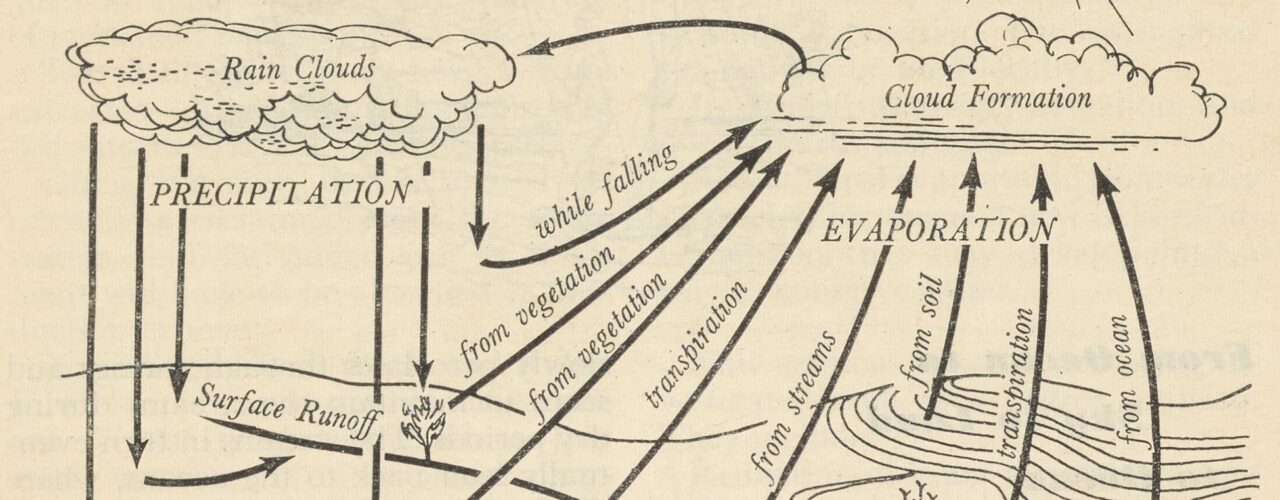
“There’s a lot to be known about water,” wrote Alfred Stefferud in his preface to Water: The Yearbook of Agriculture 1955. Stefferud was the yearbook’s editor. Among the things he and his contributors thought should be known about water in 1955 were “How to Get More Snow Water from Forest Lands,” “Drainage of Peat and Muck Lands,” and “The Yazoo-Little Tallahatchie Flood Prevention Project.” One of the book’s earliest chapters, “Where We Get Our Water,” included this half-page visualization of the hydrologic cycle.
Water: The Yearbook of Agriculture 1955 was published by the United States Department of Agriculture, which released these yearbooks annually beginning in 1894. I encountered this image as part of my research in the Othmer Library’s collections for our new exhibition Downstream. As a museum curator, I’m always on the lookout for compelling images to use in interpretive projects. But I’ve also long been interested in this type of graphic, which attempts to represent the relationships between the individual parts constituting whole systems or spaces. This image, for example, includes the places where water is stored: clouds, plants, soil, streams, and the ocean. It represents the two broad processes through which water moves between the Earth and its atmosphere: precipitation and evaporation. Among the many arrows showing the movement of water across and around this cycle, the graphic points out in its center that some precipitation doesn’t even make it to the surface of the Earth, but instead evaporates as it falls.
I suspect that this image doesn’t surprise most readers. The concept of the water cycle is fairly familiar, and many folks have likely encountered such a visualization in a textbook or classroom. But the familiarity and legibility of such visualizations—or the absences of surprise in our encounters with them—are phenomena available for analysis. For example, scholars have considered the role atlas images played in the emergence of a distinct notion of scientific objectivity in the 19th century and the ways in which graphic representation of data has been used to articulate and advance arguments about urgent social problems.
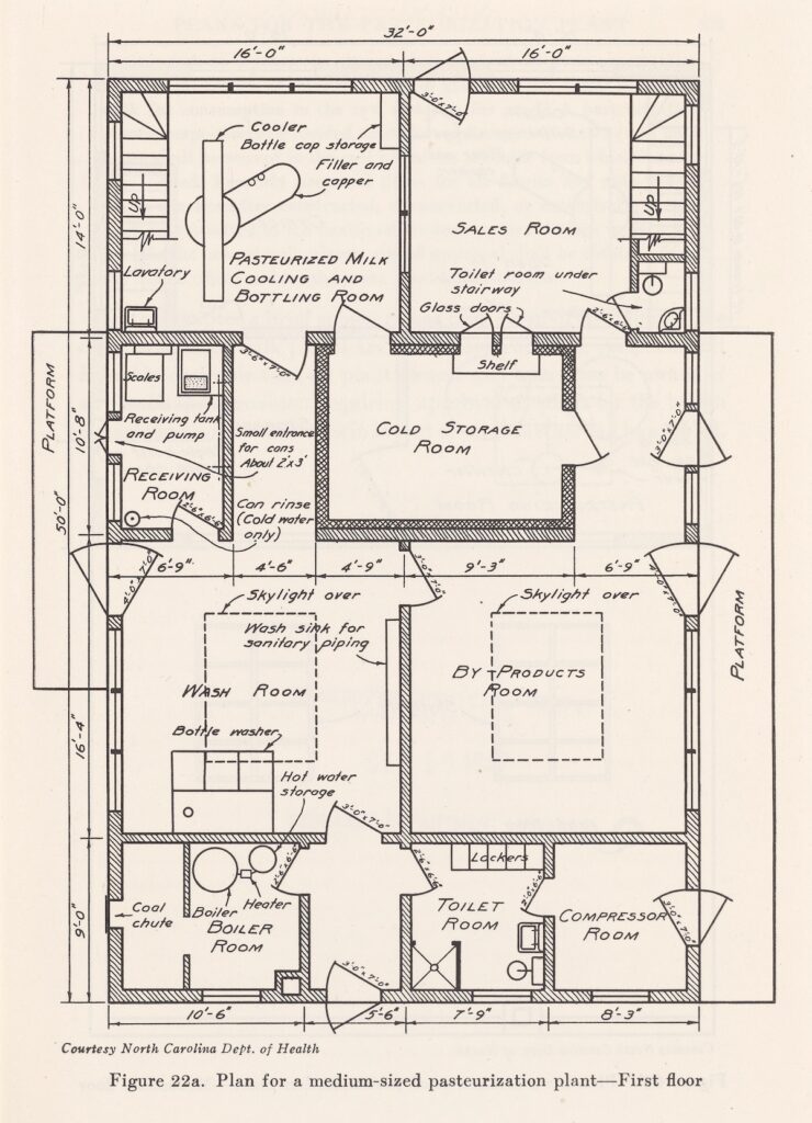
I’m especially drawn to graphics with spatial dimensions. These are images that represent or project the physical world in some way, and in doing so, go a long way toward both shaping that world and the way we see it. In research for a new interpretive project on the history of dairy science, for example, I came across this plan for a “medium-sized pasteurization plan” from the 1947 book Milk and Food Sanitation Practice by H.S. Adams.
This image raises many questions for me. Why five lockers in the Toilet Room? Why glass doors between the Cold Storage Room and the Sales Room? What makes this “medium-sized”?! Adams’s text doesn’t answer these questions, but he does provide a rationale for suggesting pasteurization plant plans.
“If a pasteurization plant is to be operated profitably, it must be intelligently laid out and equipped with modern facilities. Regardless of size, it must be planned for getting the most out of both labor and machinery; it must be sanitary and so designed that it can be kept sanitary,” he wrote.
We can suspect, then, that this floor plan and its particular configuration of rooms for processes, products, and personnel reflected Adams’s sense of which spatial relations kept dairy safe, best realized technical efficiencies, and (surprise, surprise!) maximized human output.
Infrastructural systems also lend themselves nicely to schematic visualizations, such as this cutaway illustration of a slow sand filter plant from the Water Purification Plants and Their Operation (1915) by Milton F. Stein.
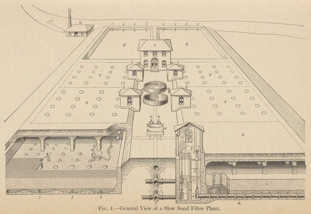
General view of a slow sand filter plant from Water Purification Plants and their Operation by Milton F. Stein, 1915.
In this system, water flows through quartz sand particles the size of granulated sugar to remove many impurities. My eye is drawn here to the natural curve of the river flowing into and out of the scene, above the hard straight lines of the plant and its variety of architectural structures including “b” in the upper left—a station with pumps pulling water from the river—and “e” in the center—the plant’s office and laboratory. In the bottom right corner, we see the technical mechanisms for regulating the level of water in the filter; on the left, we see workers manually scraping a layer of dirty sand.
For me, the power of such visualizations resides in their attempt to represent in a single instance the complex relationships between parts and wholes. The familiarity of their visual conventions obscures the fact that this is a conceptually and intellectually bold move! Historians similarly identify and articulate such relationships, but primarily through speech and text. I am drawn toward museum curation for the diversity of tools—text, media, images, objects, and architecture—available to make such connections. But even museum exhibitions, whether physical or digital, require visitors to move through time and space. In contrast, these images evoke a sense of immediacy for me. They are dramatic encounters with the world as it was, as it is, and as it could be.
Featured image: Illustration of “The Hydrologic Cycle” from the USDA’s Water: The Yearbook of Agriculture 1955.
Public perceptions of 20th-century medical science as seen through book cover illustrations.

The Institute’s museum education team partners with Philly Touch Tours to offer a more meaningful history of science experience.
Mapping Philadelphia’s industrial past with digital tools.
Copy the above HTML to republish this content. We have formatted the material to follow our guidelines, which include our credit requirements. Please review our full list of guidelines for more information. By republishing this content, you agree to our republication requirements.